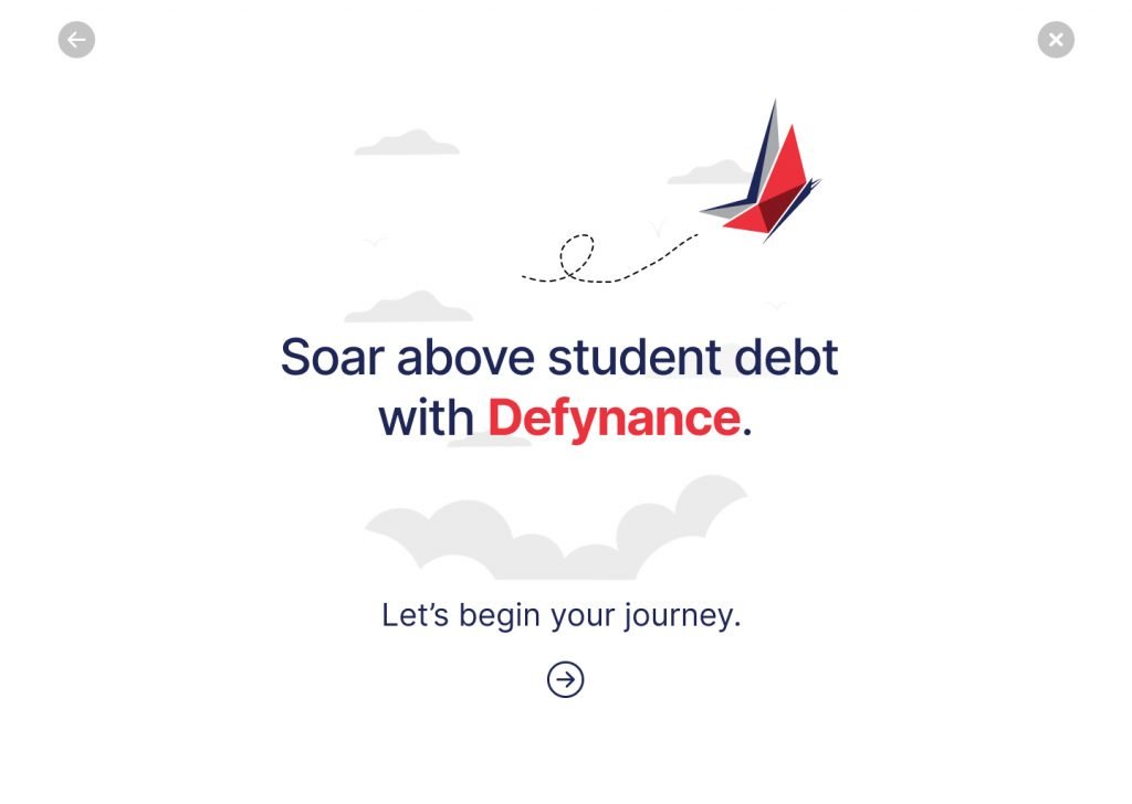
Defynance, a Fin Tech driven company, is determined to help tackle student loan debt by offering alternative options for students. They needed an interactive web tool that not only educated their users on student loan debt but also explained the benefits of Defynance’s services.
Senior UI Designer | 3 team members
2.5 weeks
UX Research; UI Design; Interaction Designer
OVERVIEW
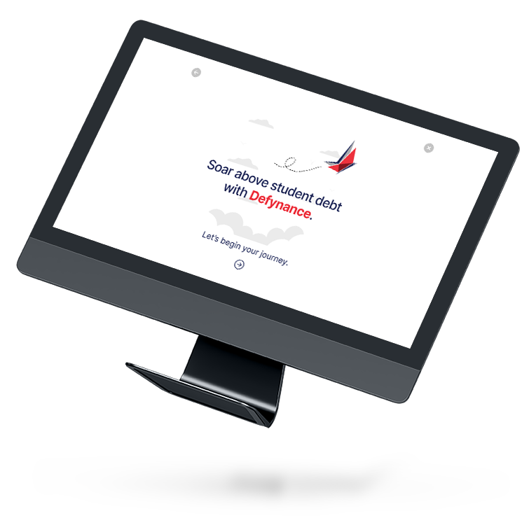
Designated lead designer and researcher for a client’s web based, high fidelity prototype for an onboarding tool.. This tool is to be housed on the home page of their current website in order to provide and educate users with financial literacy information and educational content on student loan debt. Additionally, Defynance looks to use this tool to generate qualified leads for the company.
RESEARCH
We needed to gain an in depth understanding of the users’ current perceptions and experiences with their student loan debt in order to gain useful insights into potential users’ needs. I led the development of a Typeform questionnaire in order to gather user insights and experiences with student loan debt and lenders. Also facilitated in drafting of interview questions for more quantitative data.
Defining The Problem
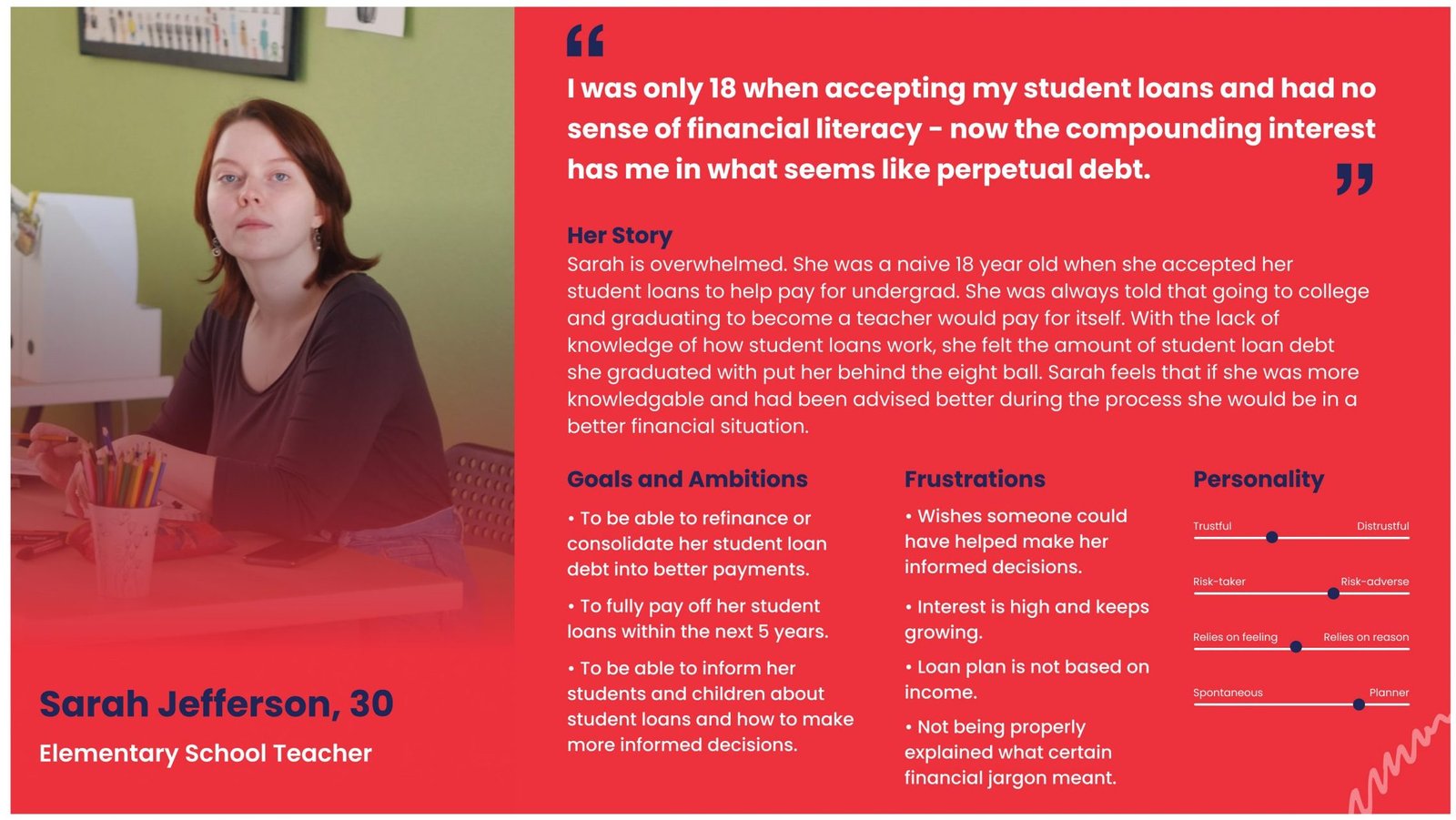
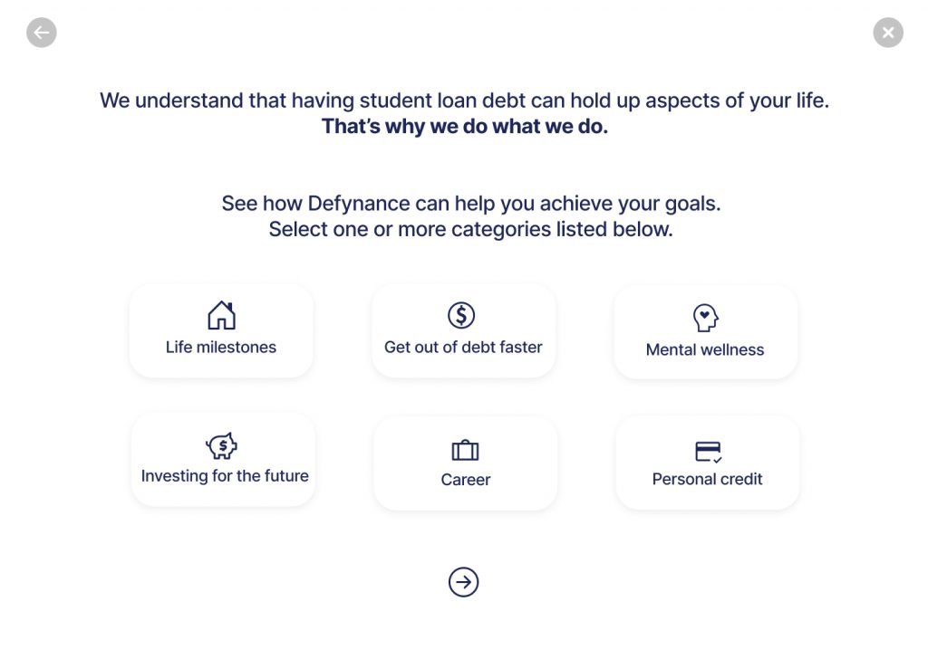
With the help of the preliminary user research, we were able to develop two user personas. Both personas have the same overall problem and goals but each had different pain points with their previous student loan debt experiences. We wanted to develop a problem statement for each user to give insight on the different pain points.
Mike’s Problem – Trust Mike needs a reliable and transparent source about student loan refinancing so that he can learn about the implications alternative methods have on helping him get out of debt and save for his family’s future.
Sarah’s Problem – Education Sarah needs a way to easily access and understand personal finance information because she needs better guidance when applying for refinancing services so that she can make educated decisions.
Initial Research Methods
User Surveys
User Interviews
Analysis Methods
Affinity Mapping
Upon synthesizing research, I was able to develop the following 4 insightful key takeaways:
Users wanted to be guided through the student loan journey
Users wanted to be educated throughout the process
Users wanted a personalized journey tailored to their particular life goal(s)
Be able to trust the company along the way
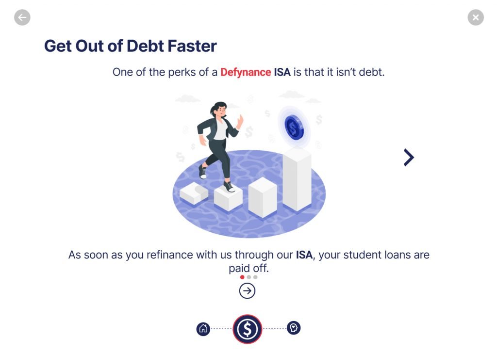
“We believe that creating an engaging and interactive lifestyle tool will help guide users through learning how they can benefit from a Deyfnance ISA as a solution to our users while helping Defynance obtain more qualified leads.”
Design Mission
With the problem statements and user needs now clearly defined, we developed the design hypothesis: Following up the design hypothesis, we then asked ourselves – how might we:
Competitive Analysis
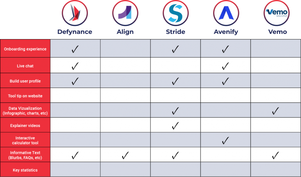
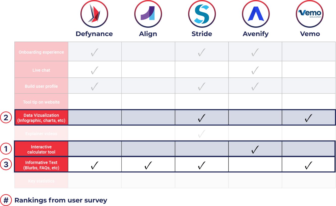
Next steps were to take a look at Defynance’s competitors while also looking at companies with similar user experiences; overall, identifying any areas of opportunity while building the web tool. The key takeaways discovered from the competitor analysis were that there was an opportunity for Defynance to differentiate itself with this lifestyle tool. The data aligned with our survey results where data visualization, an interactive calculator tool, and including informative text were what users ranked during surveys as the three most effective ways to convey information to them.
Comparative Analysis
During the comparative analysis to take a look at other companies with key aspects users expressed they felt were necessary during a user journey learning about student loan debt. We wanted to focus on 3 key aspects we needed to include in our journey tool which were an effortless journey, easily digestible information, and personalization of the journey. Here’s a breakdown of the companies we found and the aspects we chose:
Design
Conducting a design studio with 6 fellow UX designers, we brainstormed aspects and features based on user research. This resulted in creative concepts and sketches such as interactive calculators, gamification, and some type of user journey experience as features of the tool.
With our design mission and how might we’s in mind, we drafted a few initial screens keeping Defynance’s brand and existing tone in mind. We wanted to keep the UI clean and simple while at the same time provide information to users in a digestible way. Here are the initial designs:
Usability Test
My team and I collaborated on a script as a guide to use during usability testing. I personally conducted an observational usability test with two users via screen share on Zoom. The users I interviewed were currently paying or had paid student loan debt at some time in the past. We used a card sorting method in order to discover key areas of improvement and insights.
5
Initial Test
25+
Useful Insights
4
Areas to Improve
20+
Modifications
Key Takeaways
Felt the tool was informative and animations helped keep journey engaging.
State that they could trust the website and company based on the look and feel.
The overall feel of the tool helped to make it feel okay to deal with mental health issues that accompany student loan debt.
Imagery and animations made them happy and engaged.
Felt the tone and mood of the journey was supportive and reassuring.
Journey felt personalized because they were able to choose goals that specifically appealed to them.
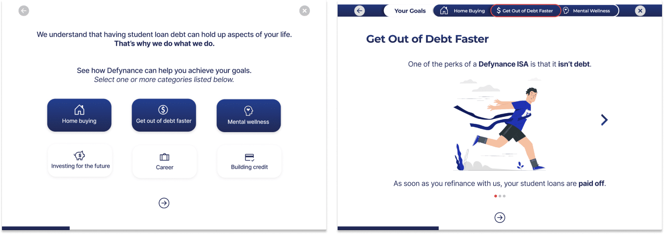
Iterate
Now we were cooking! With feedback from the first round of usability testing we saw that we were heading in the right direction with the design and meeting users needs. We went back to the wireframes and made over 20 modifications to the design based on user feedback. Below are some of the key iterations made.
Navigation
Pain Points
Navigation during life goals area was not clear with the different arrows
Placement of bar on bottom of screen seems congested with other elements
Resolution
Refined design of progress bar to incorporate labeling of goals
Placed navigation bar at the top of the screen to solve confusion
Original Version
Modified Version
Building Trust
1. Tone of copy 2. Brand identity 3. Clean, uncluttered UI
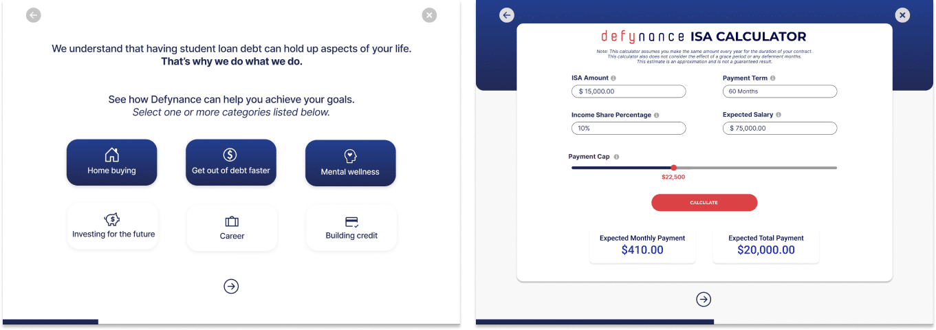
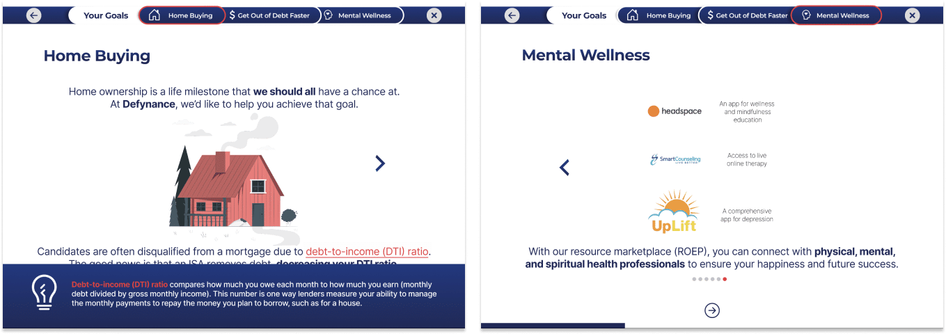
Interactive Journey
4. Choosing life goals 5. Interactive Calculator
Educational
4. Life goal content 5. Tooltips 6. Defynance resources
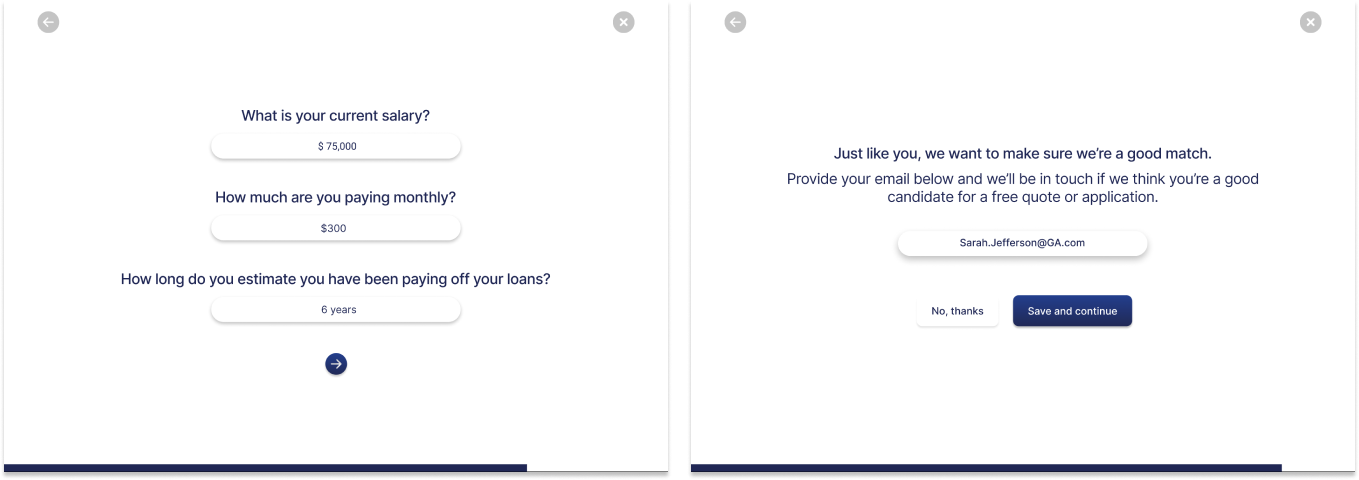
Business Needs
4. Lead generation 5. Contact Information
Summary
After a 2.5 week sprint, hours of user research, and days of design, we were able to produce a final MVP prototype that:
Educates and informs users in an interactive way
Build a tool users can trust
Create a personalized journey
Meets business goals
Feel free to view the full deck presentation for the Defynance user journey tool here.