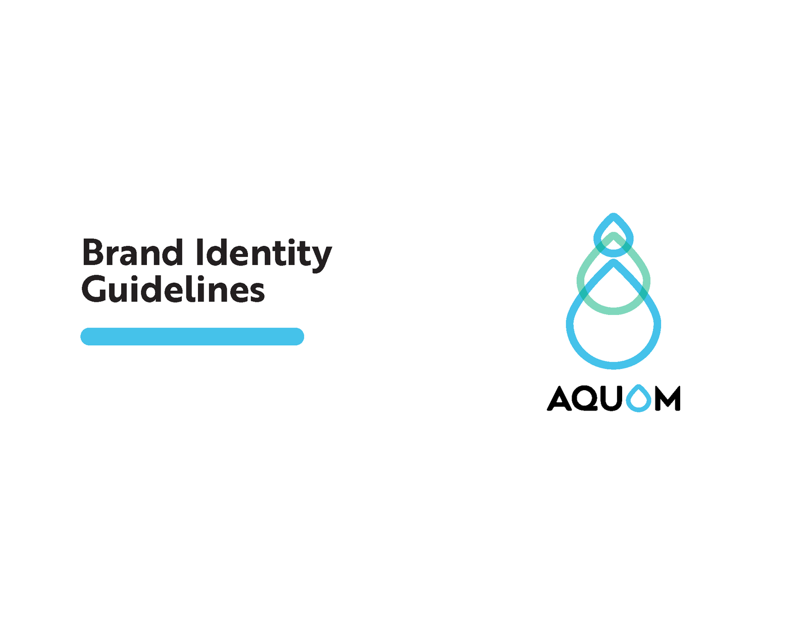
I was tasked with redesigning and developing the brand identity for AquOm, a company that aims to use all-natural, organic, and non-toxic polymers harvested from the ocean in order to reduce inorganic nutrients in public waterways and oceans.
Client: AquOm Date: August 2020 Role: Sole Designer + Strategist Duration: 2 weeks
Creative Brief
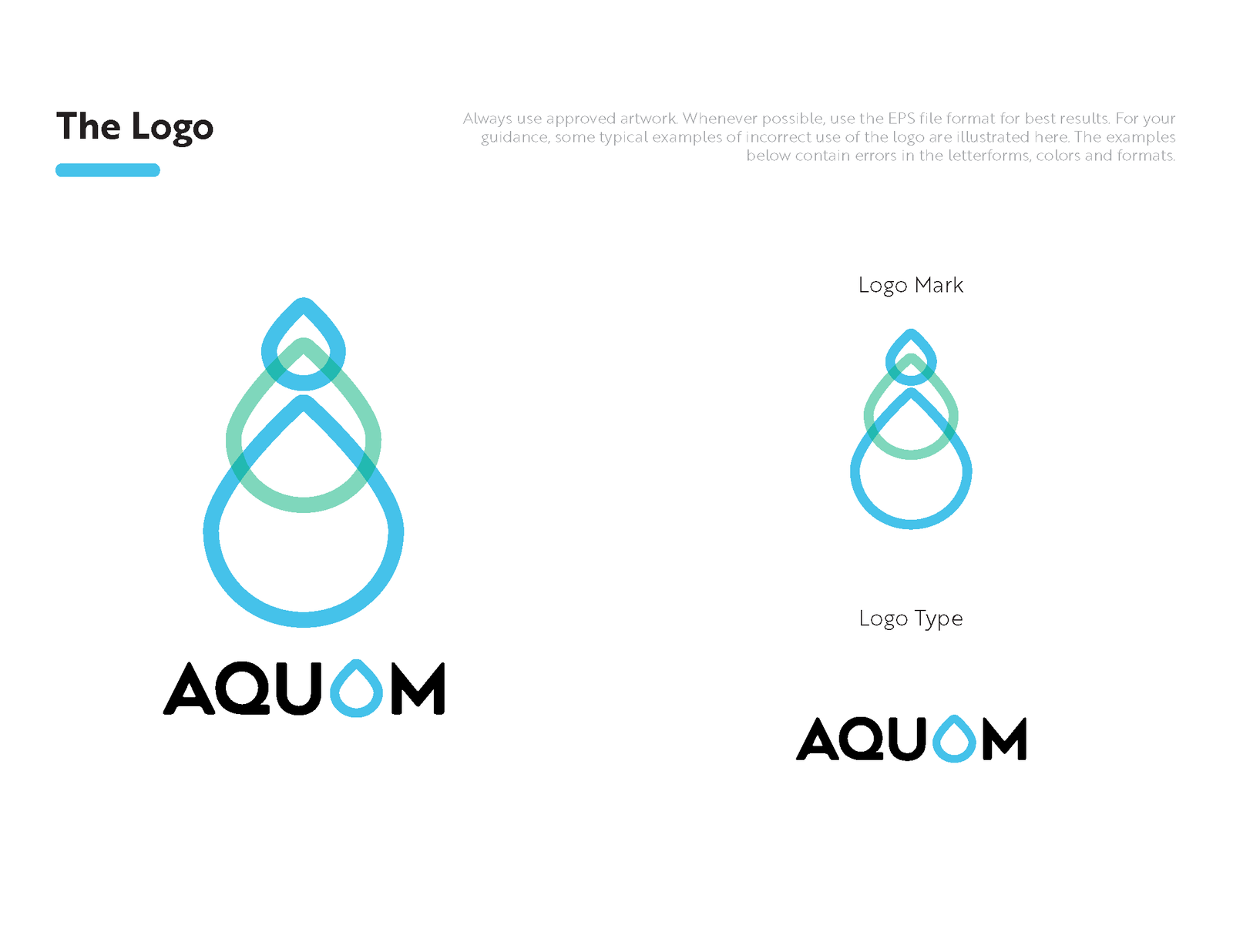
After an in-depth kickoff call with the client, I discovered the brand name AquOm is a combination of ‘aqua’ meaning water of course, and ‘om’ referring to the ‘Ommmmmm’ sound used in meditation. Om is the sound/frequency that people believe to be the ultimate frequency/vibration of peace and balance. After a synthesizing input from the client and research, I aimed to incorporate the following key takeaways and insights:
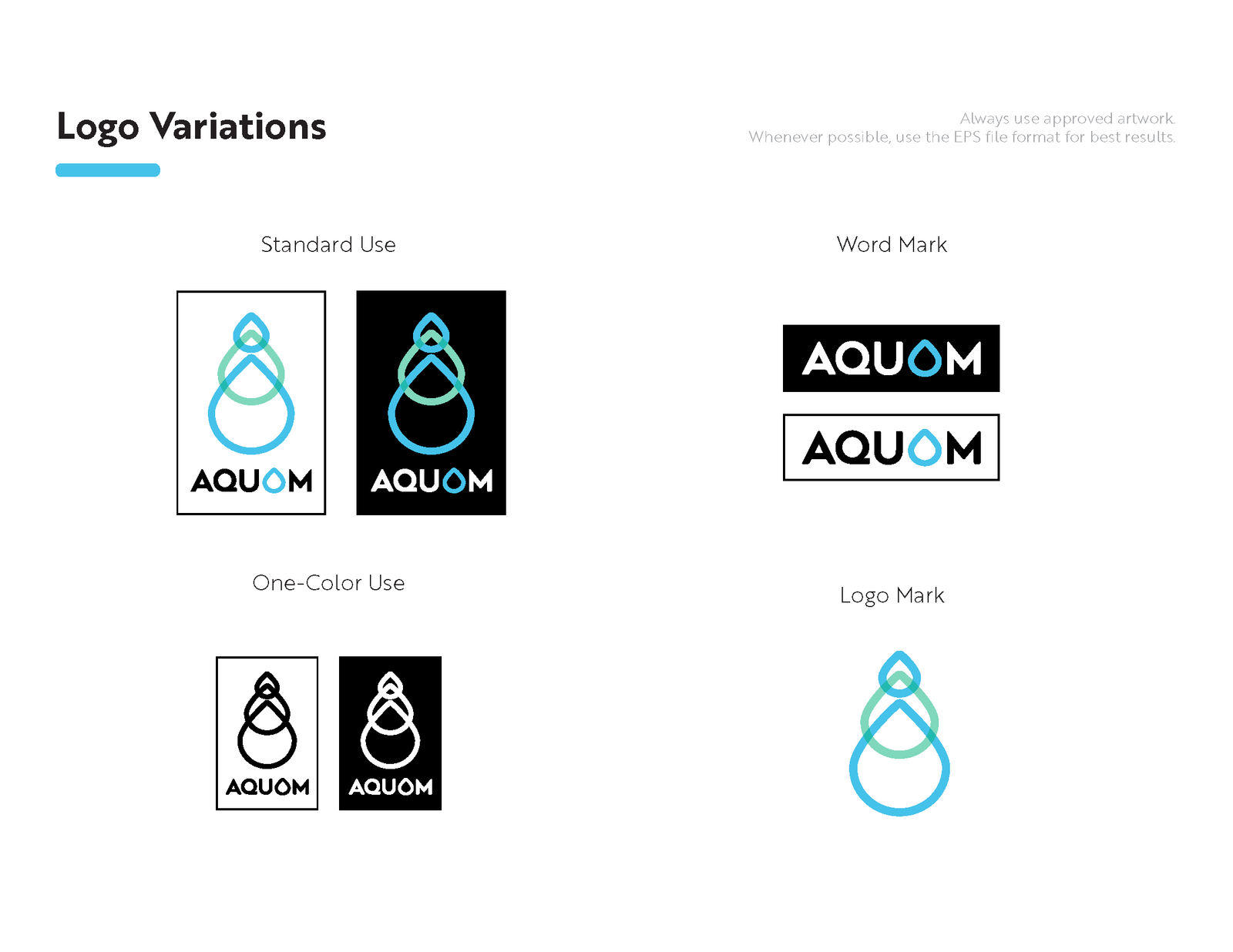
Colors: We see using some gradient flows of blues.. maybe a little green to represent clean, nature, etc. but mainly blues. Gradient for ‘water,’ refreshing feel
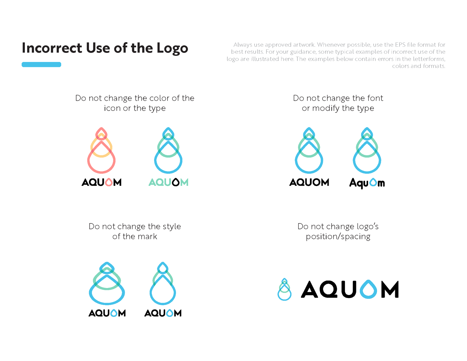
Shape/Theme: We see an element that is peaceful and circular/rounded shape to represent serenity and balance. Try to stay away from sharp, hard edges and squares. Font: Something modern but sleek and peaceful. Round shaped more than squared maybe.
Objective
After assessing my research from the kickoff call and also conducting my own discovery, my goal became to create a unique brand logo and identity that included elements evoking a feeling of balance and serenity in combination with elements symbolizing natural bodies of water. Also to incorporate blues and greens in the brand colors to represent nature and water. I designed a total of (3) concept logos for the client to choose a final concept from. Click here to view all of the concepts.