Defynance, a Fin Tech driven company, is determined to help tackle student loan debt by offering alternative options for students. They needed an interactive web tool that not only educated their users on student loan debt but also explained the benefits of Defynance’s services.
Lead UX+UI Designer
2.5 week duration
User Research :Interaction Design : Design System
Jump to:
Overview
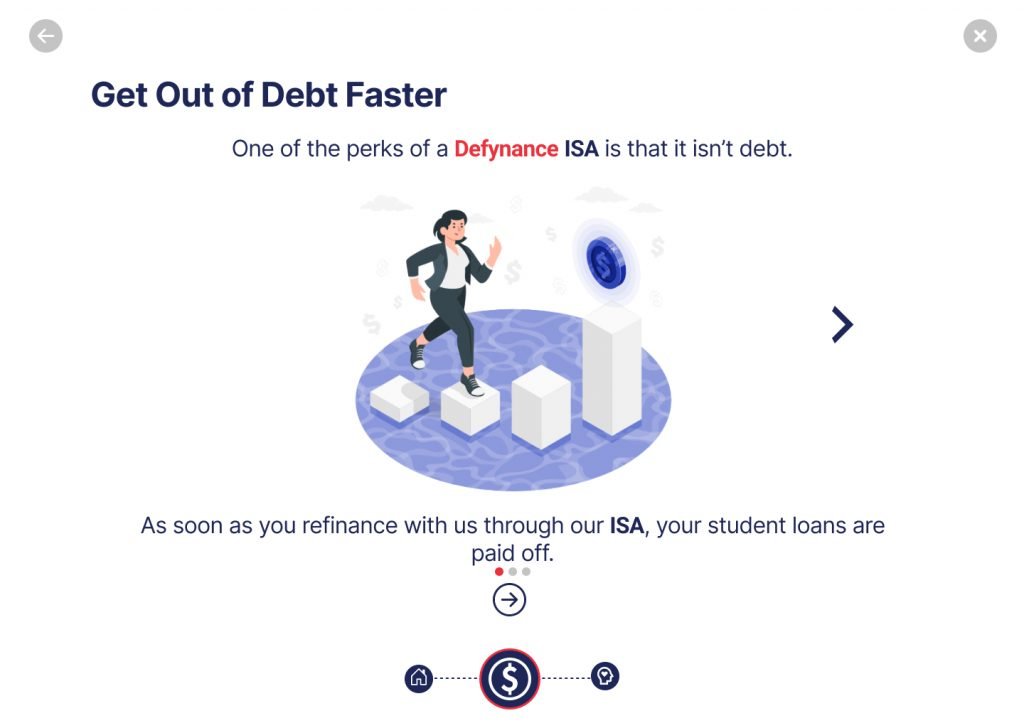
Acting as designated lead designer and researcher for Defynances web based, high fidelity prototype for an onboarding tool.. This tool is to be housed on the home page of their current website in order to provide and educate users with financial literacy information and educational content on student loan debt. Additionally, Defynance looks to use this tool to generate qualified leads for the company.
Research
We looked to uztilize 2 initial research methods: user surverys and user interviews. We then utilized affinity mapping to synthesize the results of the surveys and interviews.
Upon synthesizing research, I was able to develop the following 4 insightful key takeaways:
Users wanted to be guided through the student loan journey
Users wanted to be educated throughout the process
Users wanted a personalized journey tailored to their particular life goal(s)
Be able to trust the company along the way
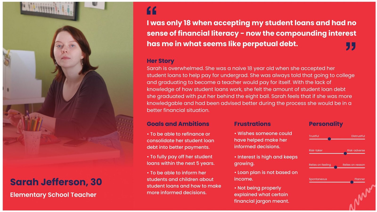
USer personas and their problems
With the help of the preliminary user research, we were able to develop two user personas. Both personas have the same overall problem and goals but each had different pain points with their previous student loan debt experiences. We wanted to develop a problem statement for each user to give insight on the different pain points.
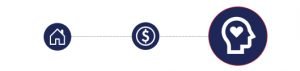
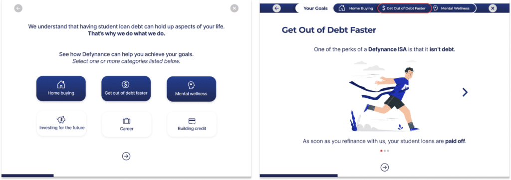
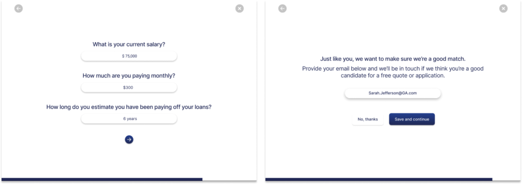
“We believe that creating an engaging and interactive lifestyle tool will help guide users through learning how they can benefit from a Deyfnance ISA as a solution to our users while helping Defynance obtain more qualified leads.”
Design Mission
Following up the design hypothesis, we then asked ourselves – how might we:
Competitive Analysis
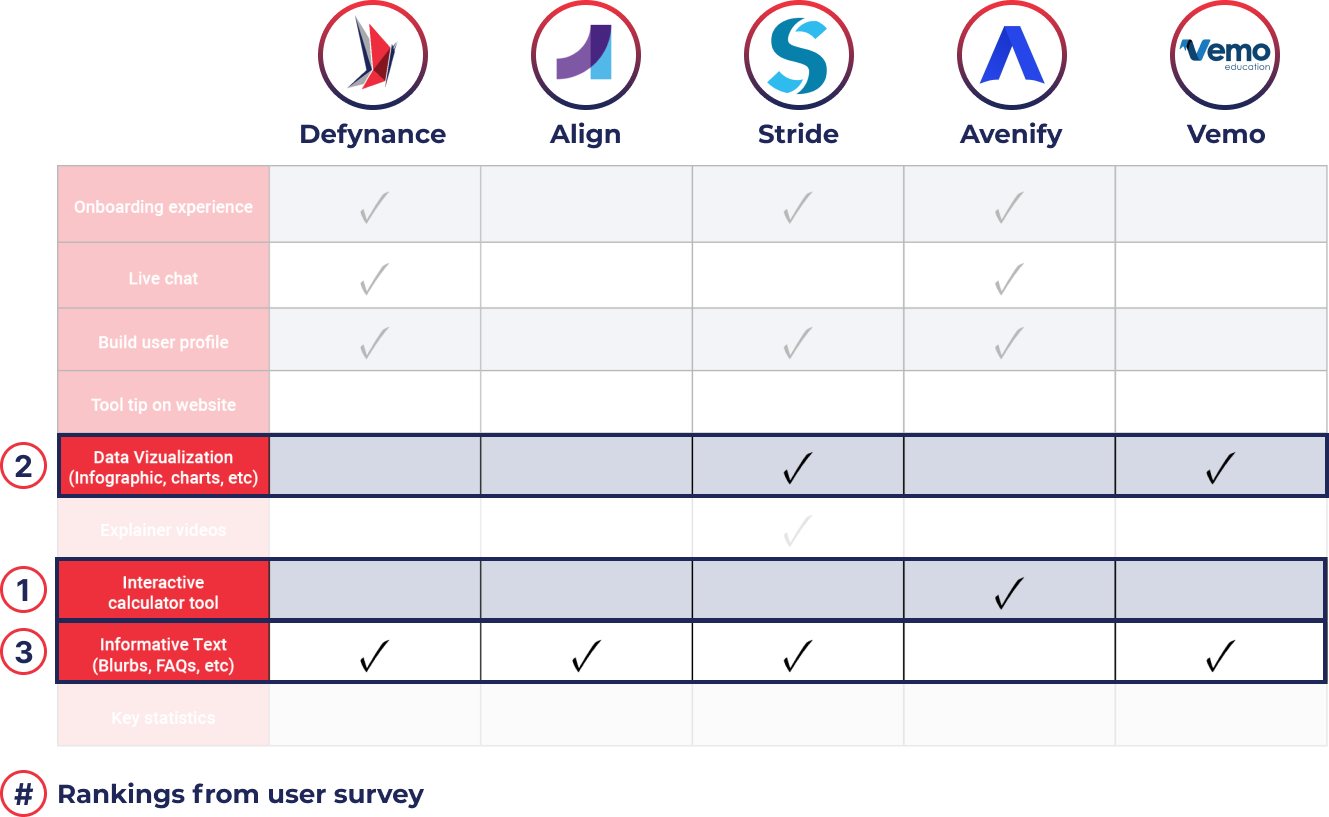
Next steps were to take a look at Defynance’s competitors while also looking at companies with similar user experiences; overall, identifying any areas of opportunity while building the web tool. The key takeaways discovered from the competitor analysis were that there was an opportunity for Defynance to differentiate itself with this lifestyle tool. The data aligned with our survey results where data visualization, an interactive calculator tool, and including informative text were what users ranked during surveys as the three most effective ways to convey information to them.
Comparative Analysis
During the comparative analysis to take a look at other companies with key aspects users expressed they felt were necessary during a user journey learning about student loan debt. We wanted to focus on 3 key aspects we needed to include in our journey tool which were an effortless journey, easily digestible information, and personalization of the journey. Here’s a breakdown of the companies we found and the aspects we chose:
Design
Conducting a design studio with 6 fellow UX designers, we brainstormed aspects and features based on user research. This resulted in creative concepts and sketches such as interactive calculators, gamification, and some type of user journey experience as features of the tool.
DESIGN System
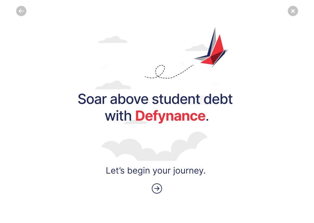
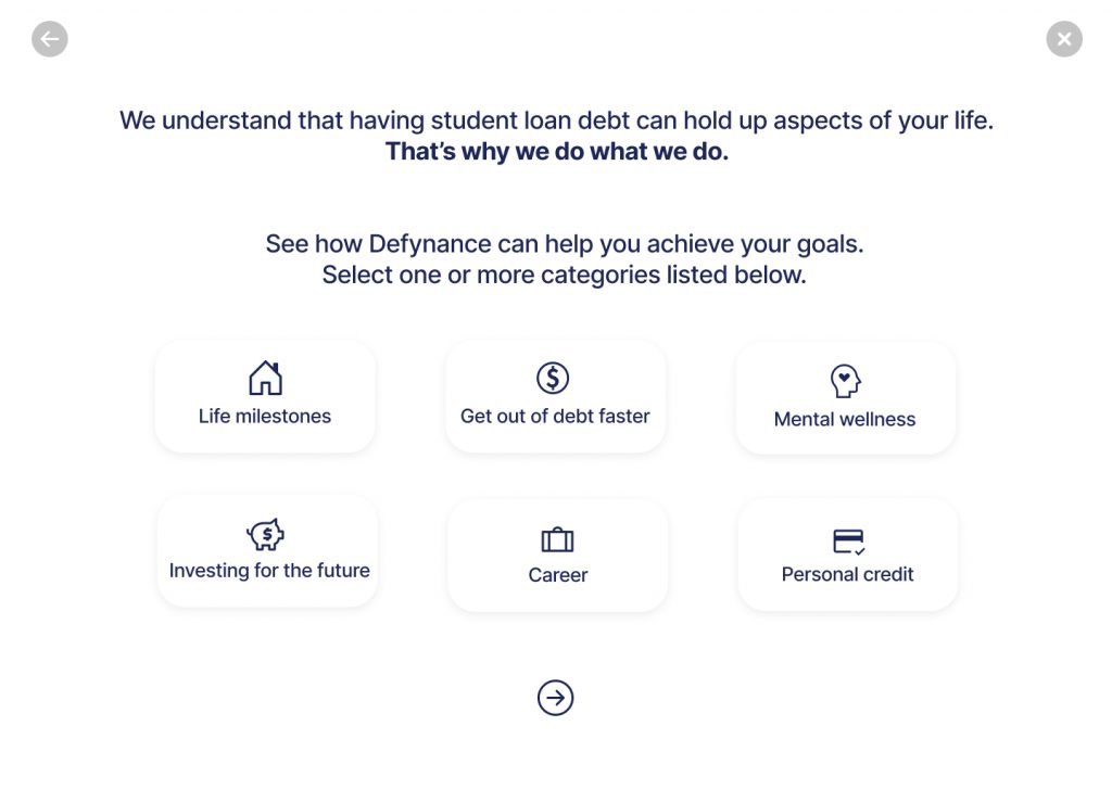
With our design mission and how might we’s in mind, we drafted a few initial screens keeping Defynance’s brand and existing tone in mind. We wanted to keep the UI clean and simple while at the same time provide information to users in a digestible way. Here are the initial designs:
My team and I collaborated on a script as a guide to use during usability testing. I personally conducted an observational usability test with two users via screen share on Zoom. The users I interviewed were currently paying or had paid student loan debt at some time in the past. We used a card sorting method in order to discover key areas of improvement and insights.
5
Initial Test
25+
Useful Insights
4
Areas to Improve
20+
Modifications
Key Takeaways
Felt the tool was informative and animations helped keep journey engaging.
State that they could trust the website and company based on the look and feel.
The overall feel of the tool helped to make it feel okay to deal with mental health issues that accompany student loan debt.
Imagery and animations made them happy and engaged.
Felt the tone and mood of the journey was supportive and reassuring.
Journey felt personalized because they were able to choose goals that specifically appealed to them.
Iterations
Now we were cooking! With feedback from the first round of usability testing we saw that we were heading in the right direction with the design and meeting users needs. We went back to the wireframes and made over 20 modifications to the design based on user feedback. Below are some of the key iterations made.
Pain Points
Navigation during life goals area was not clear with the different arrows
Placement of bar on bottom of screen seems congested with other elements
Original Version
Modified Version
Design GOALS
BUILDING TRUST
1. Tone of copy 2. Brand identity 3. Clean, uncluttered UI
Interactive Journey
4. Choosing life goals 5. Interactive Calculator
educational + informative
4. Life goal content 5. Tooltips 6. Defynance resources
business goals
4. Lead generation 5. Contact Information
Summary
After a 2.5 week sprint, hours of user research, and days of design, we were able to produce a final MVP prototype that:
Educates and informs users in an interactive way
Build a tool users can trust
Create a personalized journey
Meets business goals
Feel free to view the full deck presentation for the Defynance user journey tool here.
Collaborating with such a proficient UX and development team on this project further enriched my skill set, providing and invaluable opportunity for growth and learning.
Westlake Pipe & Fittings is a prominent PVC pipe manufacturer offering a variety of industrial solutions for municipal water, sewer, residential plumbing, water well, agricultural, and turf irrigation applications.
Senior UI Designer
4 week duration
Interaction Design : Design System
Jump to:
Overview
After digesting the design brief developed by the UX team, I was able to synthesize the provided client goals, user research, and wireframes into 3 main objectives:
Provide an interactive design refresh aligned with the company's brand guidelines
Design a user-focused parts catalogue, and resource center
for an enhanced user experience
Develop an atomic design system capable of scaling alongside the website's growth, ensuring consistency and adaptability across all elements.
Original Web Design
3
Designers
100+
Screen Designs
75+
Components
200+
Design Hours
design
After joining the project post the UX team’s user research and wireframing phases, I was able to integrate into the design process seamlessly. Leveraging the research team’s insights, I was able to refine the wireframes into visually compelling UI designs while still aligning with the company’s brand identity and user expectations.
Wirefame
Design
Drawing from the client brief and insights provided by the UX team, I iterated on various screens and design components to optimize the overall user experience.
Table of Contents
The client wanted to feature a jump-scroll Table of Contents navigation on the Home and Segment pages to simplify user navigation on the main sections.
According to user testing insights, feedback from the audience supported this design decision.
After a few iterations, I was able to design a stylized component for desktop view.
Search and filters
With the robust resource center, I wanted to ensure that the search functionality was as seamless and intuitive for users as possible. I drafted multiple versions of search bars and filter modules for testing.
Hover interactions
“More interactive” was a key takeaway from synthesizing the client brief and user research. After collaborating with the development team to uncover any constraints, I was able to design and iterate a hover animation for key elements
Mobile design
Every web screen design need a complimentary mobile version ensuring to keep in mind usability and accessibility. This involved incorporating horizontal scrolling and drop-down content, creating an optimal mobile experience.
DESIGN System
Building and developing an atomic design system was key to the success of this project. Working components and variations allowed for a streamlined design, prototyping, and developer handoff process.
"We really love the sub-menu on the left-side of the homepage. This was a perfect implementation of our thoughts and vision. Great job!"
-Westlake’s Product Manager
Summary
During my tenure, I played a pivotal role in the UI buildout across four design sprints, encompassing over 100 screen designs, fueled by countless cups of coffee. This project significantly honed my skills as a UI designer, allowing me to refine my craft of prototyping, advanced auto-layout structures, atomic design systems, and unwavering focus on both user needs and company objectives.
Collaborating with such a proficient UX and development team on this project further enriched my skill set, providing and invaluable opportunity for growth and learning.
With great satisfaction, I was able to successfully meet and exceed the design needs and goals outlined in the beginning of the project.
Provide an interactive design refresh aligned with the company's brand guidelines
Design a user-focused parts catalogue, and resource center
for an enhanced user experience
Develop an atomic design system capable of scaling alongside the website's growth, ensuring consistency and adaptability across all elements.
OneSolution is a leading manufacturing sales company dedicated to providing comprehensive solutions for industrial needs. With a focus on innovation and customer satisfaction, OneSolution offers a diverse range of high-quality products and services tailored to meet the demands of modern industries, ensuring efficiency and excellence in every project.
Sole UX+UI Designer
3 week sprint
UX Research : UI Design : Protoyping : Interaction Design : Design System
Jump to:
Overview
The primary goal for this research and design project was to enhance user engagement and conversion rates while delivering a visually appealing and intuitive interface. Through extensive user research, iterative design, and usability testing, I successfully revamped the website, resulting in a 41% increase in user engagement and 36% average increase in time on page metrics.
Provide an interactive design refresh aligned with the company's brand guidelines and user needs.
Design a seamless Sales Representative Locator tool for users to connect with local reps.
1
Designer
17
Screen Designs
4
Rounds of Iteration
150+
Design Hours
RESEARCH
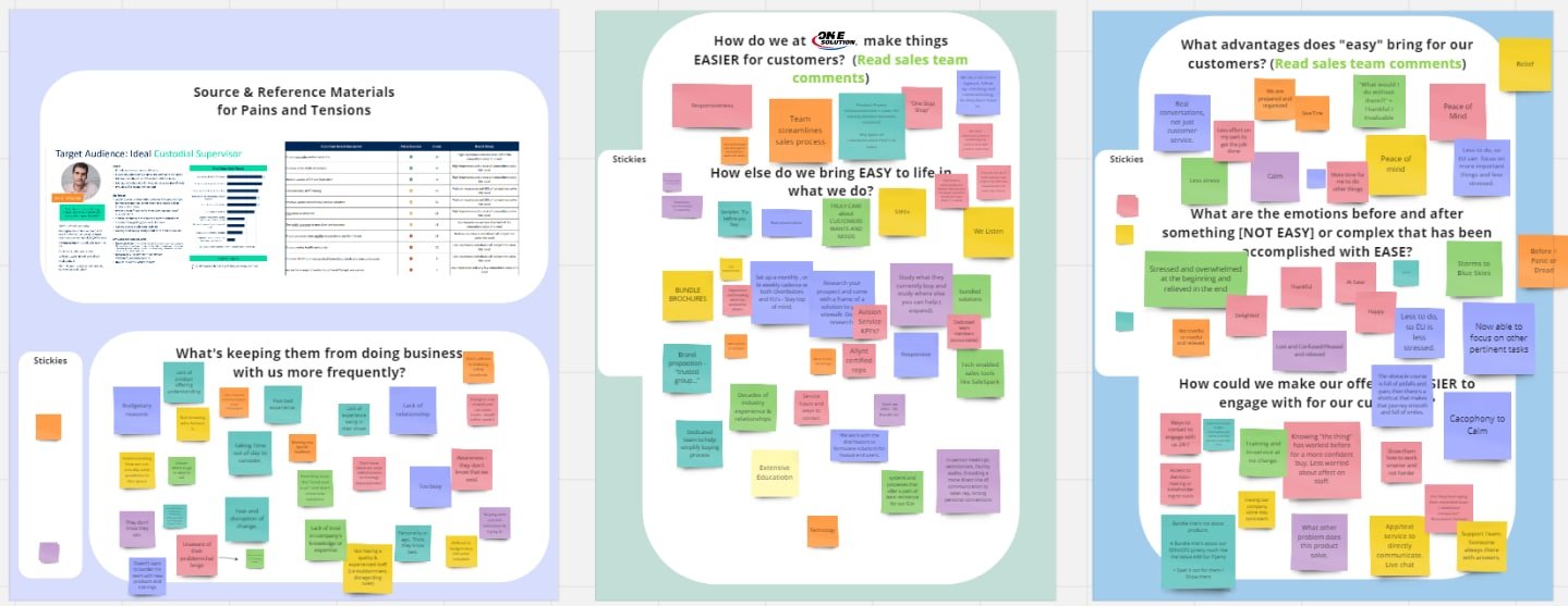
The process began with meeting with the marketing and sales department to gain a comprehensive understanding of the company goals.
I hosted a Miro session with the marketing team and users to identify current pain points being faced with the current website flow, aesthetics, and functionality.
approach
I then determined that conducting user interviews, performing a market analysis would be the most effective methods for initial research.
I also analyzed user behavior data from the existing website helped to identify needs, and preferences. I connected with the social media manager to gather quantitative insights on the original site.
After synthesizing all of my research, I was confident I had identified key challenges being faced.
Card Sort
Through three card-sorting sessions, I was able to gain invaluable insights into user preferences and behaviors, informing website structure and content strategy.
As a result, I was able to increase user engagement, leading to a more user-friendly website, improved customer satisfaction, and increased conversions.
Market Research
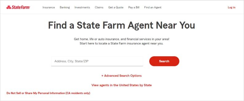
During a comparative analysis for an agent or sales rep locator tools on similar websites, I found State Farm’s Agent Tool particularly noteworthy for its ease of use and simplicity. Inspired by its effective design, I pinned this concept, possibly incorporating certain aspects of the tool into my own.
problem
Users needed a more seamless and modern experience with a simplified sales rep locater; while the stakeholders needed to build trust and increase qualified leads through the site.
design
After joining the project post the UX team’s user research and wireframing phases, I seamlessly integrated into the design process. Leveraging their insights, I refined the wireframes into visually compelling UI designs while ensuring alignment with the company’s brand identity and user expectations.
Wireframing
My wireframing process involved a comprehensive analysis of the incumbent website’s layout and content. Subsequently, I meticulously crafted wireframes that preserved the site’s most efficacious components while introducing refinements in a visually streamlined manner.
These low-fidelity mockups underwent iterative refinement cycles, informed by invaluable user feedback, aligning the design harmoniously with the company’s strategic objectives and catering precisely to the nuanced preferences of the end-users.
Design and Iteration
During the usability testing phase, I initiated the process by carefully curating a group of representative users drawn from our core demographic. I then meticulously crafted realistic scenarios that closely emulated typical user interactions with both the ‘Local Rep Search’ functionality and the broader website interface.
'find your rep' locator tool
During the usability testing phase, I initiated the process by carefully curating a group of representative users drawn from our core demographic. I then meticulously crafted realistic scenarios that closely emulated typical user interactions with both the ‘Local Rep Search’ functionality and the broader website interface.
FINAL DESIGN
Conducting guided testing sessions, I closely observed and documented users’ interactions, collecting their feedback, and identifying pain points and areas for improvement. This data-driven approach provided a solid foundation for iterative refinement, a process through which the design and functionality were continually honed to optimally align with user needs and expectations. This phase sets the stage for a detailed elaboration of the wireframes
"The Find Your Rep tool was very intuitive and helpful. The previous version seemed clunky and outdated. Eager to see future advancements of the website."
– OneSolution Customer
Summary
The culmination of this project marked a resounding success. In the web design refresh, we accomplished the creation of a modern, user-centric website that proficiently conveyed the essence of the company’s brand. Simultaneously, it delivered an intuitive and highly accessible online experience, leading to a notable enhancement in user engagement and a substantial upswing in conversion rates.
The implementation of the ‘Find Your Rep’ functionality not only streamlined users’ capacity to connect with their local representatives but also yielded a substantial surge in user engagement and satisfaction. I firmly believe that my methodological process and execution serve as a testament to my unwavering dedication to user-centered design, successfully bridging the gap between business objectives and the discerning needs of our users
With great satisfaction, I was able to successfully meet and exceed the design needs and goals outlined in the beginning of the project.
Provide an interactive design refresh aligned with the company's brand guidelines and user needs.
Design a seamless Sales Representative Locator tool for users to connect with local reps.
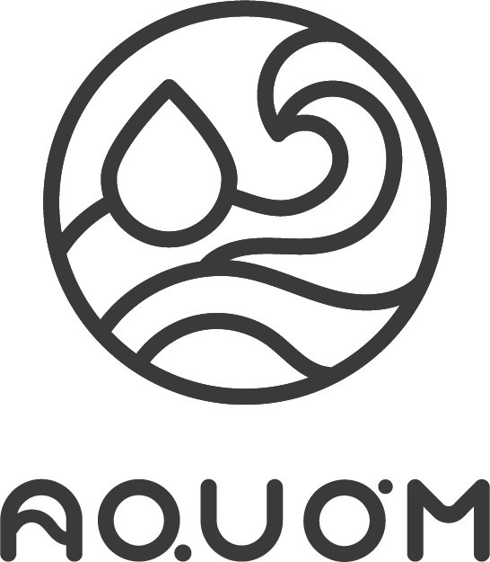
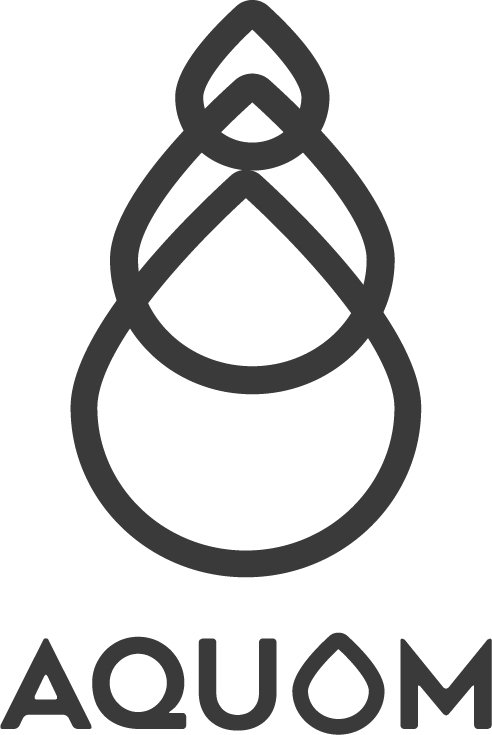
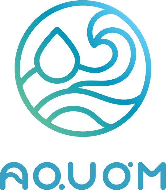
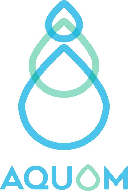
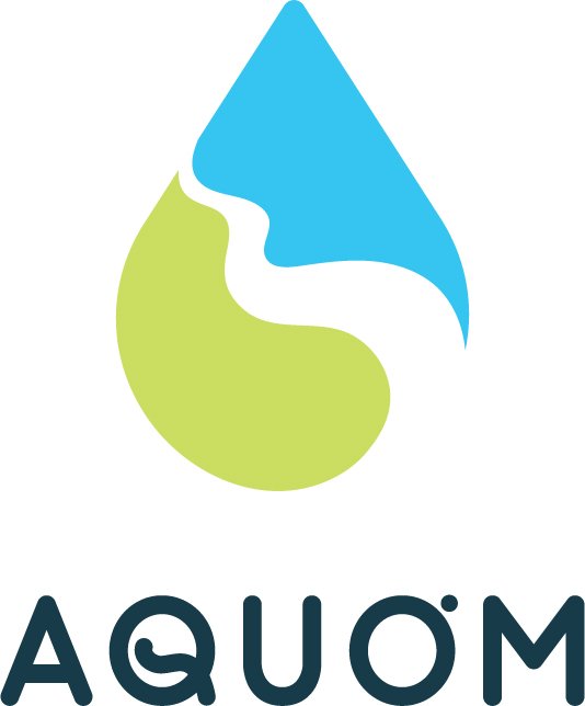
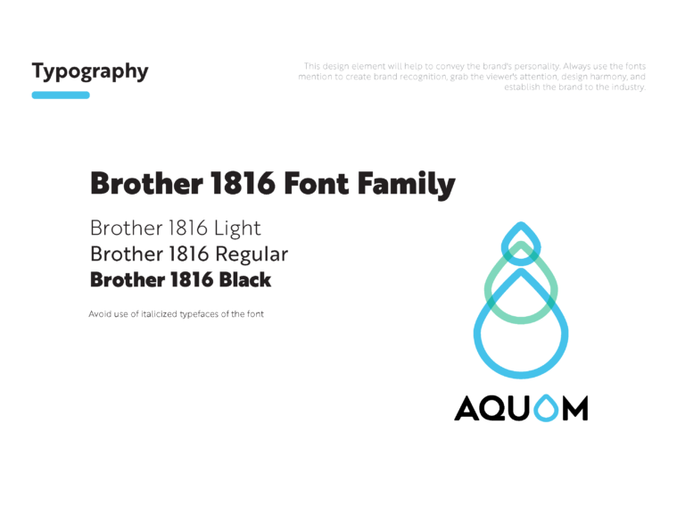
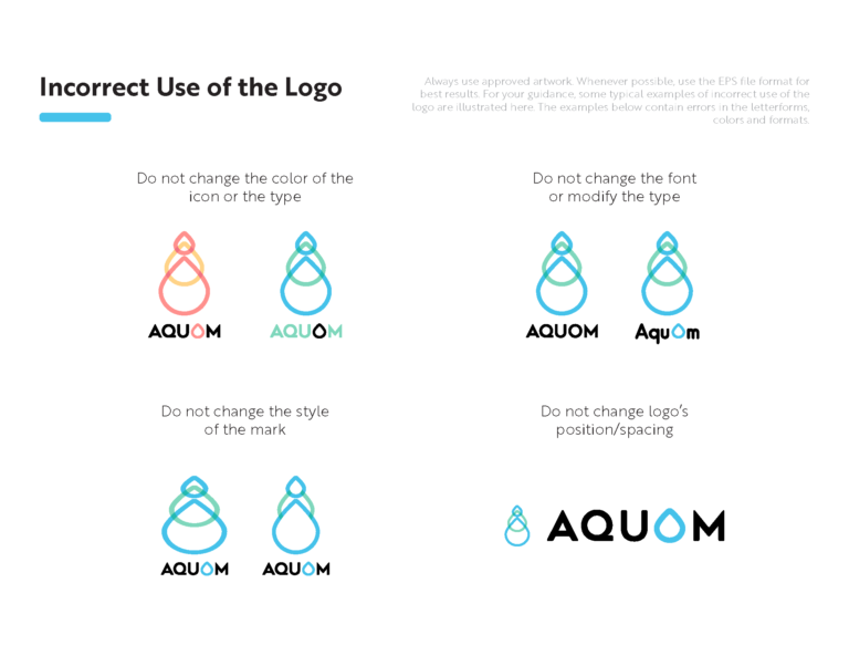
I was tasked with redesigning and developing the brand identity for AquOm, a company that aims to use all-natural, organic, and non-toxic polymers harvested from the ocean in order to reduce inorganic nutrients in public waterways and oceans.
Approach
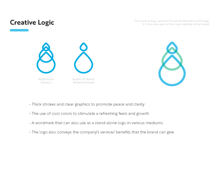
After an in-depth kickoff call with stakeholders, I began exploring ways to seamlessly integrate elements to convey a sense of balance and tranquility, coupled with symbolic representations of natural water bodies.
Based on the client’s budget, I crafted a total of (3) concepts for the client to choose a final from.
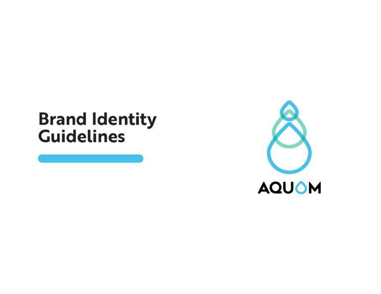
It looks as if the stakeholders were pleased. The feedback resulted just a few small iterations but they loved Concept 2! My next step was to take the final design and build out a basic brand guideline.
